Five Ways to Use Psychology for Smarter Web Design
How to use Psychology to Design Better Websites.
Apr 2015
16My wife is a psychologist, so I'm used to hearing words like 'mental models', 'anchoring' and 'cognitive dissonance' around the house. (I think I'm so clever when I accuse her of the 'Planning Fallacy' when she tells me it will only take her five minutes to get ready) so I thought it would be interesting to see how as web designers we can apply some elements of psychology to create better performing websites.
1. Cognitive Dissonance
What is it?
Cognitive dissonance is the mental stress or discomfort experienced by someone who holds two or more contradictory beliefs, ideas, or values at the same time, or is confronted by new information that conflicts with existing beliefs, ideas, or values.
What can we do?
If you're trying to promote a product that claims to make life easier, and the website selling that product isn't a breeze to use then you're creating dissonance. If you make a claim about your product or service on the home page, you can't contradict that later without creating dissonance - and a high bounce rate as a result.
Sometimes a little dissonance can be a good thing though. If you challenge someone's belief, and then offer a solution to that challenge, you can see a nice click-through ratio:
Your competitors are better than you because they use X - it's time you tried it.
And of course, creating web pages that are in harmony and create consonance rather than dissonance will turn your web site into something that is more than just the sum of its parts.
2. The Desire to Belong
What is it?
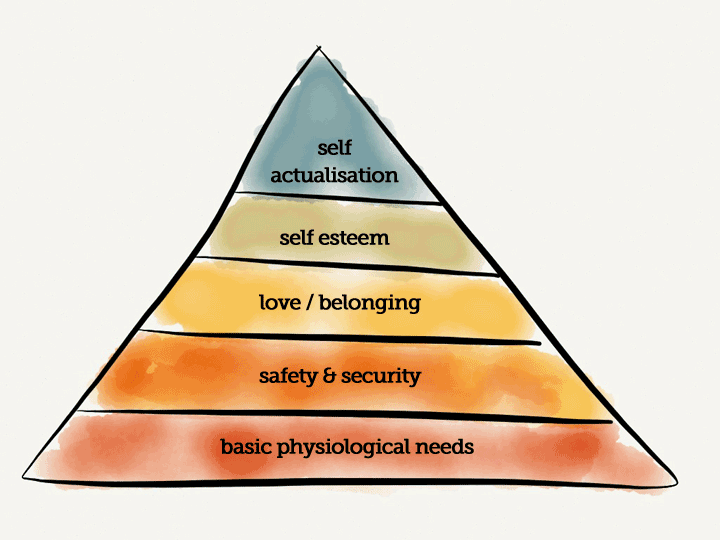
According to Maslow's hierarchy of needs (and you can't write about psychology without mentioning that!), the desire to belong is a basic human need:

What can we do?
If you can make your website visitors feel like they belong you will get better engagement. Make sure the text is appropriately written and use photos that will connect with your audience.
3. The Bandwagon Effect
What is it?
The probability of someone doing something increases with the proportion of other people who have already done so.
What can we do?
If you've got a lot of customers, don't be shy about it:
Join the millions of people already using X
is a very persuasive headline.
4.Analysis Paralysis
What is it?
If something is over-complicated, with too many detailed options, it can result in no choice being made. Doing nothing is the brain's safest choice.
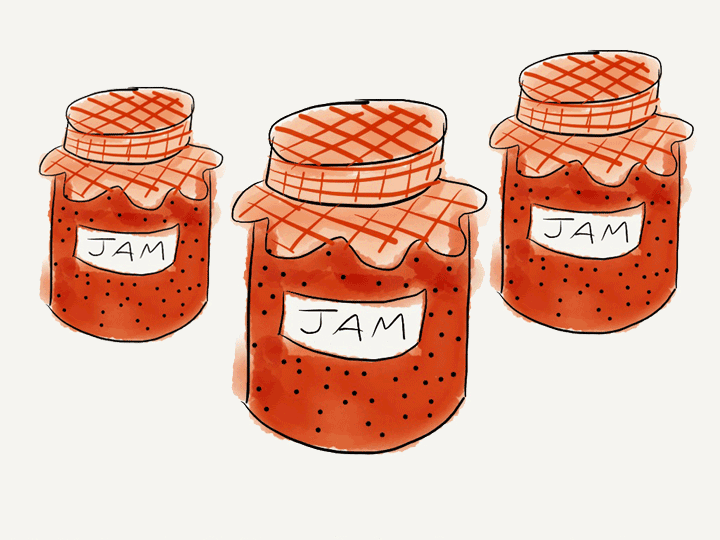
In something called the "jam jar study" psychologist Sheena Iyengar set up an experiment in a food shop. On one day shoppers saw a table with 24 varieties of jam. Anyone who tried the jam got a coupon for $1 off if they bought some. On another day, shoppers were presented with a similar table, except that there were only 6 varieties of jam. And the results? The large display generated more interest than the smaller one, but when it came to making a purchase, 3% of the customers stopping at the large table made a purchase, compared to 31% of those who stopped at the smaller table who ended up buying jam.

What can we do?
If there is too much going on; too many links, buttons and calls to action on a page then that can be a real turn off. Think about the objective of a website and laser-focus on that. Cut out the clutter.
The best site navigation limits the initial number of options, and offers more choices in a progressive way - hence the popularity of the classic drop-down top bar navigation.
5. Rhyme as Reason
What is it?
The rhyme-as-reason effect (or Eaton-Rosen phenomenon) is a cognitive bias where a saying or aphorism is judged more accurate or more truthful when it is a rhyme. It sounds crazy, but you might remember that "If it doesn't fit, you must acquit" was the signature phrase used by Johnnie Cochran to gain acquittal for O.J. Simpson.

